Delivery
A digital ecosystem built for scale
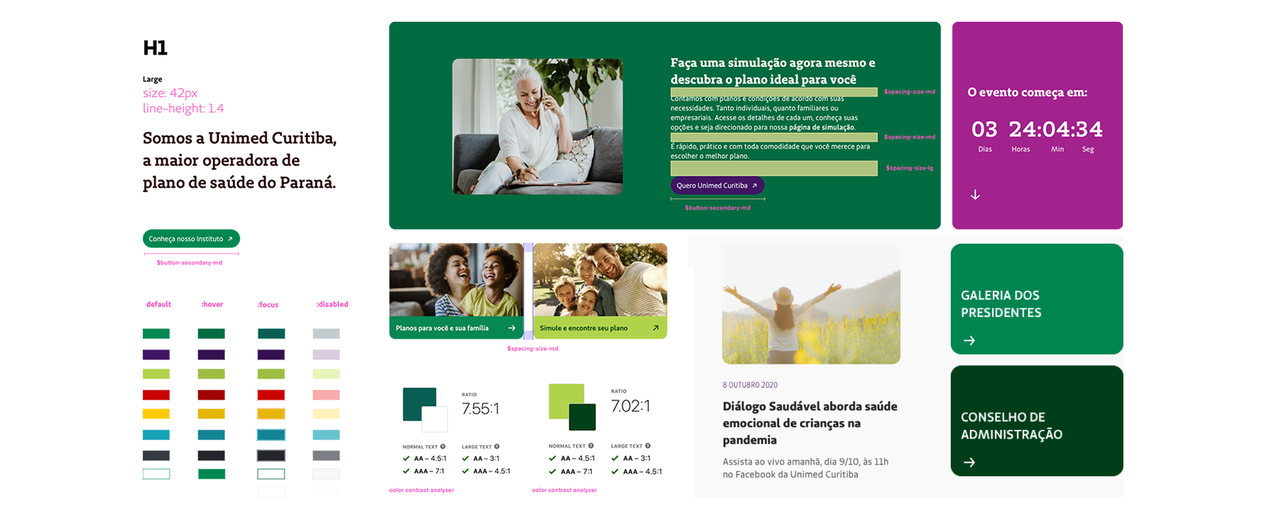
Design system
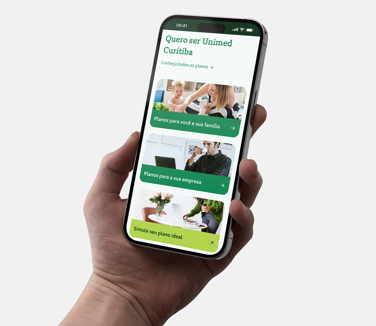
More than 350 modular components with unified design tokens. By deploying 115+ responsive templates directly into the CMS, we eliminated design bottlenecks, giving the content team full autonomy to publish in minutes.
USER INTENT & ACCESSIBILITY
We rebuilt the information architecture based on over 3,000 keywords, focusing on the 50 highest-intent searches. The structure is shallow enough to reduce clicks but broad enough to support five different user mental models.
PERSONALIZATION
A unified login with social sign-in gives families, doctors, suppliers, and staff a tailored quick-access menu. Built to comply with LGPD from day one, ensuring data protection feels like care, not a barrier.
Context and problem
Why did a thousand-page portal still make people feel lost?
As the digital presence of Paraná’s largest healthcare provider, the portal had grown to over a thousand pages. However, the experience was fragmented, and the pandemic only made these gaps more obvious. The content team was stuck, SEO was suffering, and the site was neither accessible nor personalized.
A one-size-fits-all entrance
-
Families, affiliated doctors, secretaries, suppliers and internal staff all entered through the same generic front door. There was no adaptation or sense that the portal understood who was arriving or what they needed.
Content trapped by developer dependency
-
Every minor update required a developer. This created a permanent backlog, leaving the content team with no room to publish, test, or respond to urgent needs.
Structure that mirrored the organization, not the user
-
The portal was organized around internal departments. But users don't think in departments; they arrive with a specific task and expect to resolve it in seconds.
Discovery
Every decision had to work for five different persona at once
Our process combined qualitative research with stakeholders and a quantitative analysis of traffic and search data. ANS regulations and LGPD laws shaped how we handled every piece of information and every login flow.
What the research made clear
A workaround that exposed patient data
-
Due to overly restricted accounts, secretaries often used doctors' logins, exposing sensitive patient files to unauthorized access.
Compliance gaps and risks
-
The legacy portal did not meet ANS or WCAG AA standards, risking legal fines and damaging the trust the cooperative had built over decades.
Search leading to dead ends
-
The internal search barely worked, yet users relied on it heavily, which compounded the frustration of the poor navigation.
Support overload
-
The customer service team was overwhelmed with calls for simple tasks that should have been handled via self-service on the portal.
Design principles
-
1Consistency builds trustIn healthcare, visual inconsistency signals a lack of care. Consistency across every touchpoint matters more than any single screen because it tells users they are in the right place.
-
2Security and accessibility as core materialsBoth were treated as pillars, not a final checklist. Accessibility is the bare minimum for a meaningful experience; security only becomes a barrier when it’s an afterthought.
-
3Navigation that adapts to the rolePeople don’t arrive thinking about categories. They arrive with a task. Role-based personalization works when groups are well-defined, removing the need to guess a label at the front door.
Challenges and Trade-offs
Personalization vs. Navigation Simplicity
🔎
CHALLENGE
-
Five personas with different needs. A single site was too generic; five sites were too expensive
✍️
Decision
-
A customizable menu that adapts to roles while keeping the core architecture unified.
⚖️
Trade-off
-
We gave up total standardization for flexibility, working with Content and Tech to ensure feasibility.
🚀
Outcome
-
Users find what they need in seconds without the experience feeling fragmented.
Data Protection vs. Effortless Entry
🔎
CHALLENGE
-
Laws required a login, but a heavy flow could push away users seeking quick results.
✍️
Decision
-
Social login to reduce friction, moving identity confirmation into the journey instead of using a "wall."
⚖️
Trade-off
-
Simplified the entry but increased technical effort and dependency on external platforms.
🚀
Outcome
-
Security and UX reinforced each other, making data protection feel like a natural part of the flow.
Search-Driven vs. Org Structure
🔎
CHALLENGE
-
The old site mirrored internal departments, burying high-intent keywords deep in the pages.
✍️
Decision
-
Analyzed 3,000 keywords and built the new structure around the top 50 searches.
⚖️
Trade-off
-
Risked ignoring institutional pages, so we carefully anchored them in the new hierarchy.
🚀
Outcome
-
Ranked keywords grew by 474%. The portal now answers users instead of reflecting the company.
Design System vs. Multiple Contexts
🔎
CHALLENGE
-
One system had to serve the portal, intranet, and member area, each with different density needs.
✍️
Decision
-
Components with "controlled variation," using fixed tokens but flexible content density and tone.
⚖️
Trade-off
-
Traded rigid simplicity for a more robust system that required more documentation and governance.
🚀
Outcome
-
350+ components ensured visual cohesion, becoming the digital standard for the entire cooperative.
Results & Impact
The numbers show the success, but what matters most is that the portal started caring for people the same way Unimed does in person
Organic Traffic
+0%
Clicks
+0%
Users
+0%
Impressions
+0%
The content team gained full autonomy. The design backlog for routine requests disappeared, and the Design System became the foundation for all future digital initiatives at Unimed.
The pandemic accelerated the shift to digital services, making it more important than ever, especially in healthcare. That’s why the new portal was designed to make things easier for everyone and streamline how the cooperative connects with our community. The same 'Way of Caring' we provide in person at our service centers and clinics is now reflected in the new portal.

Rached Hajar Traya
President of Unimed Curitiba
Learnings
Scale comes from systems, not screens
-
The most lasting impact of the project was not a single interface, but the system behind it. Shared components, templates, and governance removed operational bottlenecks and allowed design to focus on solving higher-value problems instead of recreating the same patterns repeatedly.
Security and accessibility are design materials
-
When accessibility and compliance are treated as foundations instead of final checklists, they stop feeling bureaucratic. In healthcare, clear navigation, accessible interfaces, and frictionless protection communicate the same thing: care.
Teamwork over individual design
-
Complex healthcare ecosystems cannot be designed in isolation. Aligning SEO, Content, Technology, BI, and Design required continuous negotiation between technical constraints, business priorities, and user needs. The cohesion of the experience came from orchestration, not individual ownership.
My Role
I was the Product Designer responsible for leading the visual and structural redesign of the portal, working closely with a cross-functional team. While I drove the Design System and interface execution, this project was a deeply collaborative effort across multiple disciplines.
RESEARCH & STRATEGY
-
✓ Participated in stakeholder interviews to understand business constraints, user pain points, and compliance requirements
-
✓ Led the intranet information architecture redesign in collaboration with internal stakeholders and technical teams
DESIGN EXECUTION
-
✓ Designed the full experience: Public Portal → Login → Intranet
-
✓ Created the unified login flow with social sign‑in, balancing LGPD compliance with ease of entry
-
✓ Defined the personalization logic per role without forcing users to self‑identify at the front door
-
✓ Led the visual design for 115+ templates across portal, client area, and intranet
UI & DESIGN SYSTEM
-
✓ Replaced traditional wireframes with high‑fidelity prototypes, reducing prototyping time by 40%
-
✓ Built 350+ modular components with unified design tokens, spacing, and accessible color palette
-
✓ Refined visual hierarchy, and responsive behavior for all five user contexts
-
✓ Documented states, edge cases, and rules to serve as a single source of truth for the team
VALIDATION & DELIVERY
-
✓ Coordinated with Technology to validate component feasibility and avoid technical debt
-
✓ Ensured WCAG AA and ANS compliance were embedded from the first draft, not treated as a final checklist
-
✓ Delivered detailed specs and implementation guidance for developers
-
✓ The Design System became the foundation for future digital products across the cooperative